Non-profit organization that provides information and aims to help improve the health of users in need.
Tools used
What is our objective?
The purpose of creating this website was to assist a non-profit organization in building its website to provide information and establish communication with individuals suffering from chronic pain. During the website design process, interviews with members of the association were taken into consideration
User persona
After interviewing four people, their explanations were analyzed to identify their pain points and needs. Based on this study, three buyer personas were created to represent different groups of users who will access the website. Subsequently, three different journey maps were generated, which assisted in the creation of the website.
Luisa
Luisa started experiencing headaches a year ago. She's very frustrated because she has visited a neurologist, been on medication for a long time, and it seems like nothing is solving the problem. She's seeking information through social media and comments from people going through something similar.
Ricardo
One day, Ricardo woke up with severe lower back pain and didn't know who to turn to. After several internet searches, he came to the conclusion that the best thing for him would be an association that could support him with his problem
Marisa
Marisa started experiencing pain many years ago, which led her to quit her job and become a homemaker. She has been seeing doctors for a long time, but she believes they haven't pinpointed her issue correctly. A friend tells her about an association, and she becomes curious.
Information architecture
For the development of the information architecture, the organization's need to raise funds and recruit volunteers was taken into account. Additionally, the users' needs were also considered.
Design process
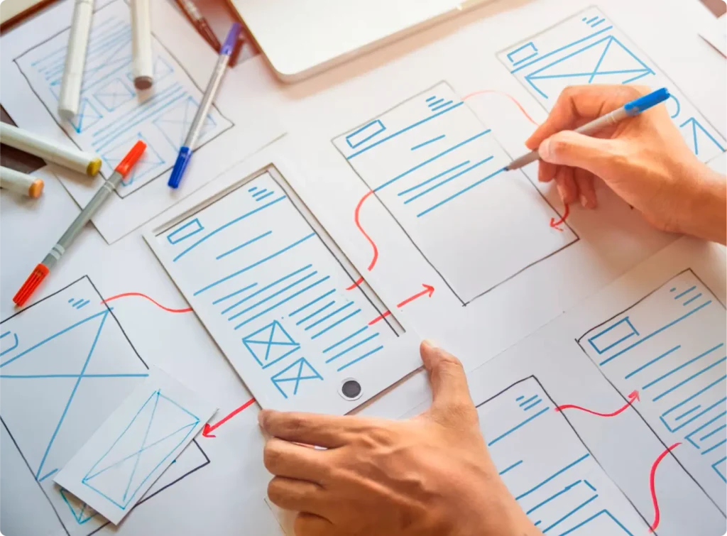
Wireframing :
The structure was focused on allowing the user to navigate the website through the navigation bar and various action buttons. Most of these buttons lead the user to register as a member.
Low fidelity:
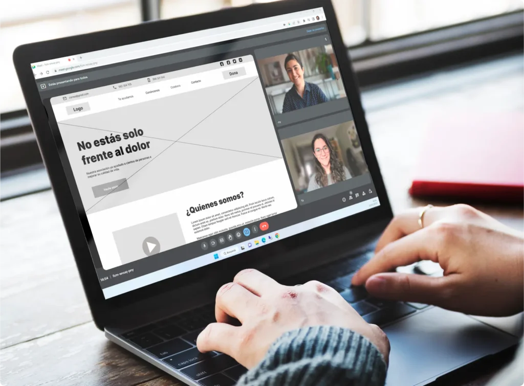
After establishing the basic structure, a low-quality design was created in Figma. Then, different screens were connected, and a second round of interviews with various users was conducted to test the design. Based on the feedback received, necessary modifications were made.
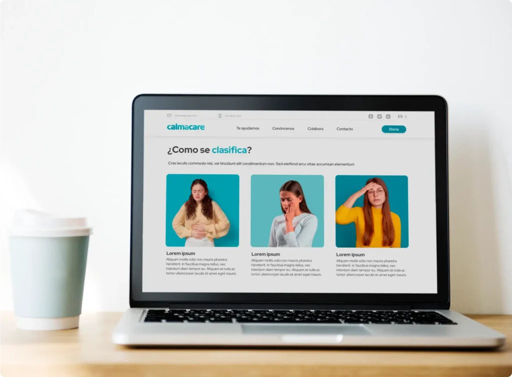
High fidelity:
In this phase of the process, the initial design, which had been created in a low-quality version, was transformed. Images were added, typography was applied, and specific colors selected in previous phases were implemented."
Do you want to try the web?
You don't have to wait any longer, here's the link to start using it.
This website uses cookies so that we can provide you with the best user experience possible. Cookie information is stored in your browser and performs functions such as recognising you when you return to our website and helping our team to understand which sections of the website you find most interesting and useful.
Strictly Necessary Cookies
Strictly Necessary Cookie should be enabled at all times so that we can save your preferences for cookie settings.
If you disable this cookie, we will not be able to save your preferences. This means that every time you visit this website you will need to enable or disable cookies again.
3rd Party Cookies
This website uses Google Analytics to collect anonymous information such as the number of visitors to the site, and the most popular pages.
Keeping this cookie enabled helps us to improve our website.
Please enable Strictly Necessary Cookies first so that we can save your preferences!